| RECENT POSTS DATE 4/30/2024 DATE 4/30/2024 DATE 4/25/2024 DATE 4/25/2024 DATE 4/25/2024 DATE 4/24/2024 DATE 4/21/2024 DATE 4/20/2024 DATE 4/18/2024 DATE 4/18/2024 DATE 4/14/2024 DATE 4/13/2024 DATE 4/13/2024
| | | CORY REYNOLDS | DATE 6/7/2016In his funny, clear preface to the new design monograph, Design for People: Stories About How (and Why) We All Can Work Together to Make Things Better, Scott Stowell of Open writes, As a designer (and as a person), I want the things I make to tell you about themselves. I like bright colors, clean shapes, and friendly words. Big type. Hard edges. No fuss. I try to be clear, whether Im making a philosophical argument, a set of instructions, or a joke. 'What is it? Its this.'" Whether he's explaining a complex design project for a major company like Google, Bravo, or Brooklyn Bridge Park, geeking out on industry terms like "gradient" or "grid," or just tipping his hat to influences as diverse as Battle of the Network Stars and his old boss and mentor, Tibor Kalman, Stowell presents a lively, democratic portrait of his own work, Open and the design process itself. Below is a Q&A on the newest page-turner from Metropolis Books.
CORY REYNOLDS: I love your fun, simple, quiet graphics for Brooklyn Bridge Park! I live nearby, and walk through it every week. I used to wonder what designer had gotten that huge job, with miles of waterfront paths, numerous sports facilities and now a marina, and, quite simply, didnt fuck it up. Can you tell me how you arrived at the design?
SCOTT STOWELL: In the book, our former Brooklyn Bridge Park client says something about us making design part of the thing, as opposed to something extra. Thats a goal of mine in all of our work. A sign in a park is actually in a park. Its just one element in peoples field of vision. So it cant (and shouldnt) be or do everything. It needs to fit in, to be aware of its relationship to its environment and the people who use it. I feel the same way about all the things we make, including the book.
CR: The book is funny. Humor and wit are clearly important to Open.
SS: They are. For me, every project is a chance for people to interact. That happens in face-to-face meetings, in correspondence, and even through the work itself. Jokes (or details or facts or stories) help people understand each other in all those situations.
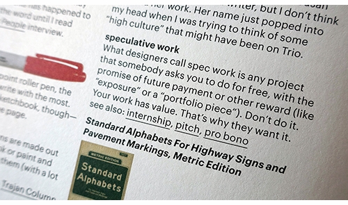
CR: The glossary is wild. It's 15 pages, sporadically illustrated and idiosyncratic. It's some of the best reading in the book.
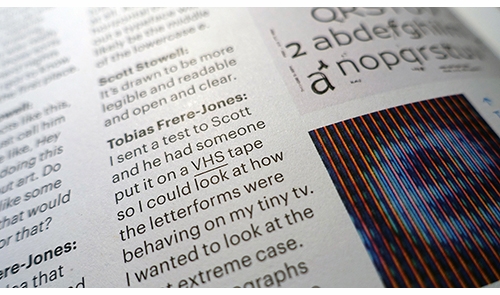
SS: The glossary started as a way to accommodate all kinds of readers. Everybody knows about different things. So you might not know what a baseline grid is, or who Milton Glaser is, or why its illegal to offer unpaid internships. I wanted to let people know about things like this without bogging down the stories (or taking up too much space in the chapters). It ended up also being a way for me to tell more stories.
CR: I love the way you personalize. Like your glossary entry for CMYK: "This stands for cyan, magenta, yellow, and black: the four-colors of ink in four-color process. I don't know why K stands for black, but when I freelanced at the New York Times, I remember the art directors there called black key."
SS: Thanks. I learned about CMYK (and four-color process) early, thanks to my Dad. He worked as a printer (a stripper, actuallya pre-press guy) for about 40 years. When I was a kid, he brought home press proofs, color-separated film, printed samples, and stuff like that. I was fascinated with all of it. The thing is, everything (including a book like Design for People) is made out of a multitude of tiny parts: halftone dots, different colors of ink, pictures, words, ideas.
CR: You refer to Citi Bike in the glossary, but it’s not one of the projects featured in the book. What did you do?
SS: I use Citi Bike almost every day, so I was super excited when Open got hired to rename, rebrand and relaunch their parent company. Now theyre called Motivate and their tagline is "Get going. Later they asked us to redesign the instruction panels on all the Citi Bike stations, so we took the opportunity to rewrite them. Now they dont just explain how the stations work, but how bike share works, too.
CR: You designed another Metropolis Book Design Revolution by Emily Pilloton. Ive always considered that book a model of clarity.
SS: That project started when I spoke at a conference in San Francisco years ago. I think Emily Pilloton was just out of school, but she was speaking there too. After my talk she strode up to me and told me my name is Emily Pilloton, and youre going to design my book. I was not about to disagree.
CR: Cute! Can you explain the origin of the book's title, Design for People?
SS: Years ago, I kept trying to define Open (the studio, not the regular word). It seemed that other studios had a thing that they did. What was ours? When making things, Ive always thought about what regular people would think. Could that be our thing?
Ive been inspired by many other books with similar titles: Design for the Real World, Designing for People, Streets for People, etc. The phrase Design for People became a way for me to describe what we do at Open that was specific and universal at the same time.
At first, Design for People was a noun: as I said, a description of our work. When I started thinking about making this book, it became a verb, too: a suggestion for others to do the same.
CR: Numerous voices are at play in each project chapter so theres a sort of 360-degree perspective.
SS: Yes. Although my voice (as seen in the instructions, the preface, the chapter intros, and the back matter) is a kind of guide through the book, the narratives in each chapter were constructed out of hundreds of individual interviews by Chappell Ellison and Bryn Smith to each tell a coherent story, like a documentary film or a radio play.
CR: In some cases, failures are addressed with even more relish than success.
SS: Chappell and Bryn made sure to cut out praise whenever possible. We didnt want this book to be a sales brochure.
CR: You write in the glossary that the online organizing program Basecamp paid for your honeymoon. Can you explain?
SS: Open has been using Basecamp for over ten years. A couple of years ago, I received a package of beautifully-designed travel-themed ephemera from them. They were offering an all-expenses-paid trip for two to one of about a dozen destinations, and all I had to do was let them know where I wanted to go. I couldnt believe it. As it turns out, my wife and I were planning a belated honeymoon in Paris for our first anniversary. We sent Basecamp our receipts. They reimbursed us. This was an incredibly delightful, unexpected reward for being a loyal client, and the most amazing part is that it wasn't publicized at all. Basecamp did this for about 50 people, and this interview might be the first time anybody else has ever heard about it. I hope that someday I could be that thoughtful.
CR: To me, as much as the book is about everyone who participated in every featured project, and as much as Open is always about the team, its also a portrait of you.
SS: I think every project is the product of all the people involved in it. Our work is the evidence of our relationships. A couple of hundred people have been part of this book, and even more were part of the work in it. But Im the only person who intersected with all of it. So I guess youre right!
CR: Having heard you speak and having read the book, it's clear that you think very quickly and clearly. At Open, you take huge, hairy design problems and distill until you're left with what feels like the most simple and obvious solutions. But conversely, you also seem to love taking ideas apart. You're not afraid of making a big mess before cleaning up.
SS: I like to figure out why things are they way they are and how they were put together. I hope Design for People has enough clues in it for curious people to figure out why it is the way it is and how it was put together.
CR: The book is designed to work. Its sort of hyper functional. Captions pop out. Texts are really short and to the point.
SS: If youre the kind of person who likes to read a whole book from front to back, youll be rewarded by a story arc with a beginning, middle and end. If you want to keep it in your bathroom and read a chapter or a page or a column at a time, Design for People also works that wayevery chapter, page and column have their own story arcs too. If your eyesight isnt perfect, the type is still readable (we tested it). And if you want to throw it in your bag and take it with you, you wont ruin it.
A lot of other books (especially books about design) are beautiful, impressive and well-made, but also elitist, fragile and unreadable. Design for People is made for people to use.
 Metropolis Books
Flexi, 6.75 x 9 in. / 256 pgs / 1,000 color.
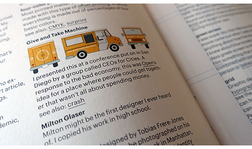
| |
|