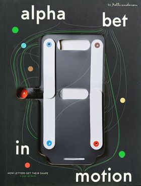
By Kelli Anderson. Edited by Ben Kiel, Caren Litherland, Michelle Santiago Cortés, Claire Evans, Emily Doucet.
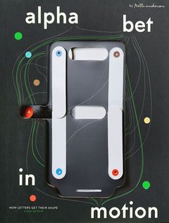
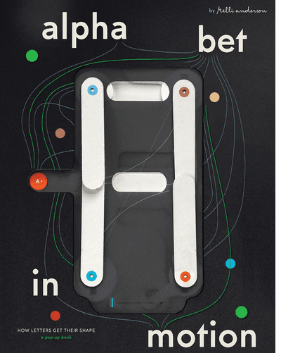
With an interactive cover, 17 pop-ups and hands-on activities throughout, Alphabet in Motion is an immersive introduction unlike any other to the history of typography and letter shapes
Ever wonder how we ended up with so many different styles of letters? Open any text editor, email client or design app and you will immediately be bombarded with a buffet of typographic choices. Serif or sans serif? Display or text? Classical or contemporary? Formal or casual? Featuring 17 stunning interactive pop-ups, this ABC pop-up book explainsas well as demonstratesthe technologies and philosophies that have shaped letterforms through the ages. Readers will learn about '60s psychedelic type by projecting light through a phototypesetting pop-up; how screen technology shaped letterforms by turning on and off anti-aliasing; or the aesthetics of typographic modularity by reconfiguring the puzzle pieces of Josef Albers' Kombinations-Schrift. Type history is often technical and always visual. It is therefore challenging to fully explain in text or in diagrams alone. The book's interactive features provide a sensory inroad for curious general readers to grasp how typography has transformed through history (and how lettering can convey a point of view or philosophical stance). A 128-page companion essay section includes an essay further contextualizing each pop-up. Alphabet in Motion puts the reader's hands, eyes and minds in touch with the meanings behind the typography that surrounds us in our homes, on our screens and on our streets. If you look carefully, you can see the history of the worldfrom the Bronze Age to the Information Agein the microcosm of type. Kelli Anderson is a graphic designer, paper engineer, educator and author who uses design magic to connect people with the hidden talents of everyday things. Her previous publications include This Book Is a Camera (MoMA, 2015)which transforms into a working cameraand This Book Is a Planetarium (Chronicle, 2017)which houses paper devices (including a planetarium) and has sold more than 100,000 copies.
PRAISE AND REVIEWS
PRINT magazine
Steve Heller
[Takes] readers through an interactive journey about the history of typography from A to Z, starting in ancient Egypt and moving all the way into the digital age. But its no ordinary history tome. Anderson hand-designed 17 different pop-ups, including light projections to colorful sliders and mind-bending illusions, that demonstrate how humans have painstakingly developed type.
Print magazine
Steve Heller
[Takes] readers through an interactive journey about the history of typography from A to Z, starting in ancient Egypt and moving all the way into the digital age. But its no ordinary history tome. Anderson hand-designed 17 different pop-ups, including light projections to colorful sliders and mind-bending illusions, that demonstrate how humans have painstakingly developed type.
Colossal
Kate Mothes
A remarkable, five-years-in-the-making project.
Colossal
Kate Mothes
A remarkable, five-years-in-the-making project.
Fast Company
Grace Snelling
This fantastical pop-up book tells the mind-bending history of typography.
The Architect's Newspaper
Kelly Pau
'Alphabet in Motion' puts the history of type into an interactive and visual explanation.
The Boston Art Review
The ultimate pop-up book for adults. The history of typethe philosophies and technologies that have shaped letterforms from the very beginningis brought to life through interactive demonstrations and accompanying essays that are sure to delight the typography lovers in your life.
The Washington Post
Ron Charles
No disrespect to all the fine novels I read this year, but the work of literature that delighted me most is a pop-up book.
The Globe and the Mail
Nathalie Atkinson
Even the cover is interactive in this immersive introduction to the history of typography and evolution of print technologies. Shape-shifting pop-ups and hands-on activities come to life throughout this wondrous book.
It's Nice That
Ellis Tree
You dont have to be a graphic designer, or even a paper specialist to take one look at Kelli Anderson new book and know that the research and prototyping process that brought the object into being was extremely rigorous. Nothing short of a feat of engineering, the designers latest title 'Alphabet in Motion: How Letters Get Their Shape' is an ingenious interactive pop up book that takes readers through an immersive and tactile history of typography.
Dwell
Jinnie Lee
In this interactive pop-up book, American graphic designer Kelli Anderson dives deep into English-language letterforms and how they came to be. Its nerdy, enchanting, and a feast for eyes.
in stock $85.00
Free Shipping
UPS GROUND IN THE CONTINENTAL U.S. FOR CONSUMER ONLINE ORDERS
Sunday, November 30, from 35 PM, Artbook at Hauser & Wirth Los Angeles presents author, designer and educator Kelli Anderson in conversation with Claire L. Evans for the launch of the remarkable pop-up book Alphabet in Motion: How Letters Get Their Shape, published by Katherine Small Gallery.
Q & A, followed by a signing.
Event livestreamed on Instagram @artbookhwla.
Please RSVP for the event and pre-order a signed copy here. continue to blog
Tuesday, November 18 at 7 PM, the Strand Book Store presents graphic designer, educator and author Kelli Anderson, discussing her new pop-up typography book Alphabet in Motion. Joining Kelli in conversation is information designer Giorgia Lupi. This event will be hosted in the Strand Book Store's 3rd floor Rare Book Room at 828 Broadway on 12th Street. Ticketing information here. continue to blog
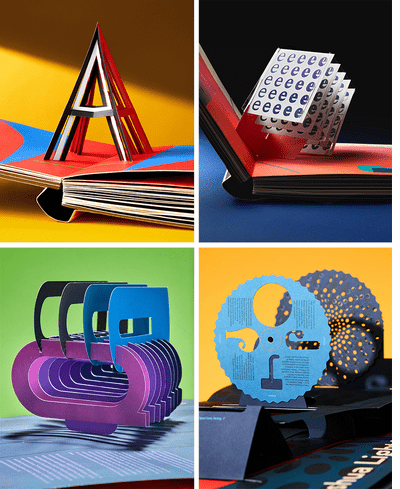
When graphic designer and paper engineer Kelli Anderson came to our offices a few years ago to explain her idea for a 2-volume, 9.5 x 12-inch pop-up book featuring some of the most complex, sculptural, and yet playfully interactive examples of type design ever conceived by persons sane or insane, now or ever, our first thought was: impossible. Second thought: magical; how many can we get? Pictured here, the letter A, along with a description of the letters evolution from an ancient Egyptian pictogram dated 3100 BCE; a 3D rendering of Noordzijs Cube, showing how slight changes affect a single letterform; a mobile-phone-powered projector that allows for undulating variations of the letter J; and interpolated Ps. Along with 13 other pop-ups, this astonishing and equally fascinating publication also features an interactive cover that allows the reader to toggle from the letter A to the letter Z with the satisfying swipe of a single finger. continue to blog
FORMAT: Hbk, 2 vols, 9.5 x 12 in. / 144 pgs / 280 color / 17 pop-ups. LIST PRICE: U.S. $85.00 LIST PRICE: CANADA $119 GBP £70.00 ISBN: 9780997175912 PUBLISHER: Katherine Small Gallery AVAILABLE: 11/18/2025 DISTRIBUTION: D.A.P. RETAILER DISC: TRADE PUBLISHING STATUS: Active AVAILABILITY: In stock TERRITORY: WORLD
Published by Katherine Small Gallery. By Kelli Anderson. Edited by Ben Kiel, Caren Litherland, Michelle Santiago Cortés, Claire Evans, Emily Doucet.
With an interactive cover, 17 pop-ups and hands-on activities throughout, Alphabet in Motion is an immersive introduction unlike any other to the history of typography and letter shapes
Ever wonder how we ended up with so many different styles of letters? Open any text editor, email client or design app and you will immediately be bombarded with a buffet of typographic choices. Serif or sans serif? Display or text? Classical or contemporary? Formal or casual?
Featuring 17 stunning interactive pop-ups, this ABC pop-up book explainsas well as demonstratesthe technologies and philosophies that have shaped letterforms through the ages. Readers will learn about '60s psychedelic type by projecting light through a phototypesetting pop-up; how screen technology shaped letterforms by turning on and off anti-aliasing; or the aesthetics of typographic modularity by reconfiguring the puzzle pieces of Josef Albers' Kombinations-Schrift.
Type history is often technical and always visual. It is therefore challenging to fully explain in text or in diagrams alone. The book's interactive features provide a sensory inroad for curious general readers to grasp how typography has transformed through history (and how lettering can convey a point of view or philosophical stance). A 128-page companion essay section includes an essay further contextualizing each pop-up. Alphabet in Motion puts the reader's hands, eyes and minds in touch with the meanings behind the typography that surrounds us in our homes, on our screens and on our streets. If you look carefully, you can see the history of the worldfrom the Bronze Age to the Information Agein the microcosm of type.
Kelli Anderson is a graphic designer, paper engineer, educator and author who uses design magic to connect people with the hidden talents of everyday things. Her previous publications include This Book Is a Camera (MoMA, 2015)which transforms into a working cameraand This Book Is a Planetarium (Chronicle, 2017)which houses paper devices (including a planetarium) and has sold more than 100,000 copies.