Edited with text by Victor Malsy, Lars Müller. Text by Indra Kupferschmid, Axel Langer. Afterword by Alfred E. Hoffmann.
Unfold the history of the world’s most famous font, Helvetica: the epitome of Swiss design
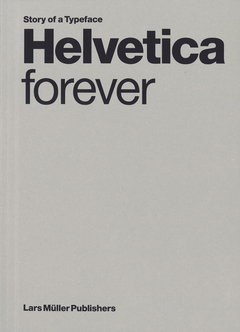
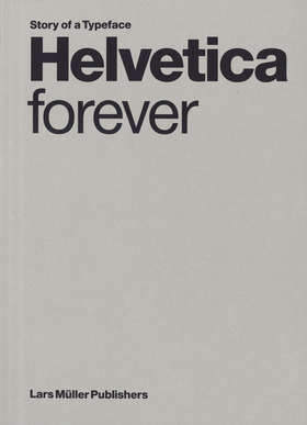
Designed in 1957, the Helvetica font is an icon of Swiss graphic design, and emblematic of the sober, functional communication adopted throughout the world in the 1950s and ’60s. The font’s balanced and perceived neutral appearance forgoes a high degree of expressivity—a quality for which it is both criticized and admired. This polarization has helped it gain unparalleled notoriety. First published in 2009 and since out of print, Helvetica forever returns in a smaller and more affordable paperback format. The book retraces Helvetica’s 50-year history, compares it to the well-known sans serif fonts of the 20th century and examines the phenomenon of its unparalleled spread. The study grows from the archive of Alfred Hoffmann, the former director of the Haas’sche Schriftgiesserei (type foundry), where, in conjunction with Max Miedinger and Eduard Hoffmann, Helvetica was developed. Accompanying illustrations show the panoply of ways Helvetica has been adopted across the world: from signal design to party flyers and subway lettering.
FORMAT: Pbk, 7 x 9.5 in. / 160 pgs / 128 color / 22 b&w. LIST PRICE: U.S. $40.00 LIST PRICE: CANADA $56 ISBN: 9783037788141 PUBLISHER: Lars Müller Publishers AVAILABLE: 9/15/2026 DISTRIBUTION: D.A.P. RETAILER DISC: TRADE PUBLISHING STATUS: Active AVAILABILITY: In stock TERRITORY: NA LA
Published by Lars Müller Publishers. Edited with text by Victor Malsy, Lars Müller. Text by Indra Kupferschmid, Axel Langer. Afterword by Alfred E. Hoffmann.
Unfold the history of the world’s most famous font, Helvetica: the epitome of Swiss design
Designed in 1957, the Helvetica font is an icon of Swiss graphic design, and emblematic of the sober, functional communication adopted throughout the world in the 1950s and ’60s. The font’s balanced and perceived neutral appearance forgoes a high degree of expressivity—a quality for which it is both criticized and admired. This polarization has helped it gain unparalleled notoriety. First published in 2009 and since out of print, Helvetica forever returns in a smaller and more affordable paperback format. The book retraces Helvetica’s 50-year history, compares it to the well-known sans serif fonts of the 20th century and examines the phenomenon of its unparalleled spread. The study grows from the archive of Alfred Hoffmann, the former director of the Haas’sche Schriftgiesserei (type foundry), where, in conjunction with Max Miedinger and Eduard Hoffmann, Helvetica was developed. Accompanying illustrations show the panoply of ways Helvetica has been adopted across the world: from signal design to party flyers and subway lettering.