| |||||||||||||||||||||||||
ARTBOOK BLOGEventsStore NewsMuseum Stores of the MonthNew Title ReleasesStaff PicksImage GalleryBooks in the MediaExcerpts & EssaysArtbook InterviewsEx LibrisAt First Sight2025 Gift GuidesFeatured Image ArchiveEvents ArchiveDATE 5/19/2026 Rizzoli Bookstore presents Pieter Henket and Justin Gaspar in conversation for the launch of 'Birds of Mexico City'DATE 5/7/2026 Join Artbook | D.A.P. at the 2026 ICP Photobook FestDATE 5/3/2026 Craftsmanship, creativity, change: 'Fashioning Chinese Women' captures twentieth-century fluxDATE 5/2/2026 Artbook at Hauser & Wirth Los Angeles Bookstore presents Ryan McIntosh and Yogan Muller launching 'Tracy Hills'DATE 5/2/2026 Join Artbook | D.A.P. at CONTACT Photobook Fair, TorontoDATE 5/1/2026 'Mathew Wong: Interiors' radiating the light of dreamsDATE 4/27/2026 Internal lyrical motives in Frida Kahlos Self-Portrait with Cropped HairDATE 4/25/2026 Artbook at Hauser & Wirth Los Angeles Bookstore presents Derek McCormack for the LA launch of 'The Shithole Opry Collector's Guide'DATE 4/24/2026 Lost City Books presents Yumna Al-Arashi and Farrah Skeiky on 'Aisha'DATE 4/23/2026 Garden passion and the passing of timeDATE 4/21/2026 Carol Bove is new from Guggenheim New YorkDATE 4/20/2026 Rizzoli Bookstore presents Chris Wiley, Nan Goldin, and Robert Swope on 'Michel Hurst: Órale'DATE 4/20/2026 Mrs. Dalloway's Bookstore presents Jane Fulton Alt, Susan Page Tillett and James Baraz on 'Still Life' | BOOKS IN THE MEDIACORY REYNOLDS | DATE 12/30/2014New York Times Features Louise Sandhaus, Author of 'Earthquakes, Mudslides, Fires & Riots'In the feature, Stoking a California Dream:
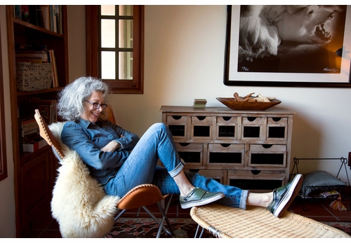
Graphic Design That Encapsulates the Golden State, Alexandra Lange writes, "'It is common practice today to place the word California in front of almost any vagrant word and thus achieve a magic combination hopefully intended to make the heart jump and the purse strings fly open,' the designer Alvin Lustig wrote in 1947. But it wasnt the word alone. Mr. Lustig and other graphic artists gave California a look, for periodicals, posters, packaging and vacation destinations, that also made the heart jump and loosened the purse strings. It was colorful, it was experimental, it was rough, it was digital. And the same can be said of the new book Earthquakes, Mudslides, Fires & Riots: California Graphic Design, 1936-1986 (Metropolis Books, $55) written and designed by Louise Sandhaus, 59, a graphic designer.
 Earthquakes, Mudslides, Fires & Riots: California and Graphic Design, 1936-1986Metropolis Books |
