| RECENT POSTS DATE 11/1/2024 DATE 10/27/2024 DATE 10/26/2024 DATE 10/24/2024 DATE 10/21/2024 DATE 10/20/2024 DATE 10/17/2024 DATE 10/16/2024 DATE 10/15/2024 DATE 10/14/2024 DATE 10/10/2024 DATE 10/8/2024 DATE 10/6/2024
| | | CORY REYNOLDS | DATE 12/30/2014In the feature, Stoking a California Dream:
Graphic Design That Encapsulates the Golden State, Alexandra Lange writes, "'It is common practice today to place the word California in front of almost any vagrant word and thus achieve a magic combination hopefully intended to make the heart jump and the purse strings fly open,' the designer Alvin Lustig wrote in 1947. But it wasnt the word alone. Mr. Lustig and other graphic artists gave California a look, for periodicals, posters, packaging and vacation destinations, that also made the heart jump and loosened the purse strings. It was colorful, it was experimental, it was rough, it was digital. And the same can be said of the new book Earthquakes, Mudslides, Fires & Riots: California Graphic Design, 1936-1986 (Metropolis Books, $55) written and designed by Louise Sandhaus, 59, a graphic designer.
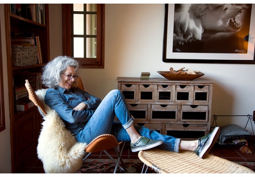
Photograph by Moira Tarmy.
As she writes in her introduction, she chose not to honor text over graphics, and she wasnt interested in being definitive. Rather, looking through archives and talking to makers, she asked questions like, 'Is this historically important work, versus is this fabulous and distinctive and sooooooo California?' The pieces in the book range in mood from the calm abstraction of John Folliss Arts & Architecture magazine covers to the pixelated trips in David Theurers I, Robot Atari game. Oh, and that title? Ms. Sandhaus wrote in an email, 'Its a cliché about California, but one that encapsulates a place where big dramatic changes happen.'
Q. You say in your introduction this project took 10 years. Why?
A. I worked for two-and-a-half years on the millennial exhibition for the Los Angeles County Museum of Art, Made in California. It was intended to talk about the relationship between California art and images of California, and to complicate that relationship. I saw California visual artists start to pull away from inspirations coming from Europe and from New York. Something similar had to have happened within graphic design.
I was also reading Reyner Banhams book Los Angeles: The Architecture of Four Ecologies. He said to tell the story of the built environment meant creating a different way to tell that story. That was impetus to think I didnt have to become a historian, or to try to force this into a conventional model.
You also came up with four ecologies, presented as chapter titles: Sunbaked Modernism, Industry & the Indies, Sixties alt Sixties and California Girls. Why those?
Lorraine Wild, a graphic designer in Los Angeles, mentored this project early on, and she came up with those titles to be able to organize the work. A commonality was a left turn or a break from tradition. There was a colorfulness to the work. There was an independent spirit that was less about following and more about defining.
Ms. Wilds essay for the 60s chapter is all about the color orange. How does orange define California design?
Lorraine started that essay on an impulse. The sunset seems orange. The ubiquitous poster for The Endless Summer (1964) has that kind of luminosity. The Victor Moscoso Neon Rose series, the luminosity of orange in there. In public consciousness, that color does become conflated with California. We grow oranges.
Orange shows up in the architecture, too.
When I think of architecture of the period, Sea Ranch is front and center. Properties were going up that were more natural, and people were starting to introduce more earthy colors: avocado and burnt orange.
You also argue that California design was a more hospitable place for women, fostering the careers of designers including Marget Larsen for the department store Joseph Magnin and Susan Kare for the Apple Macintosh.
The women attracted to here were independently minded to begin with. But because it was a backwater, women had more latitude and developed bold work that got a lot of attention. Frank Gehry invited Deborah Sussman and Gere Kavanaugh to share his office. That said, Deborah Sussman, who died earlier this year, told me about how she had to assert herself in meetings and wasnt always taken seriously.
You seem like you had fun with the design of the book. I love the pink-and-orange endpapers with little Californias and palms.
Originally I wanted there to be four books glued back to back, to suggest other books to come. This wasnt a finished story. So the patterned papers between the chapters are like endpapers, retaining that suggestion. I had an intern this summer who did something wacky with the In-N-Out Burger palm tree.
 Metropolis Books
Hbk, 7.5 x 10 in. / 432 pgs / 275 color.
| |
|

